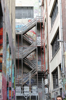
1. The left hand side is sort of floating. Should I have zoomed in or out more?

2. Needs cropping....zoom in!
3.Did it need cropping?
4. Which way round?
5. Needed to get a little more abstract.
6.Triangle, what triangle? Oh THAT triangle, sometimes you really have to look where the lines are leading you!
I've paraphrased the comments, but it is interesting getting someone else critically looking at your work. There is a need to focus more intently on what is the purpose of the picture, either in the subject or the strict composition. I also need to learn to play with Photoshop a bit more to get the most out of my photos!
Thanks Leanne!


1 comment:
Now that I have seen the images again, the third one, the Cathedral floor, better the way you took it, uncropped.
Post a Comment